What an email popup has to answer
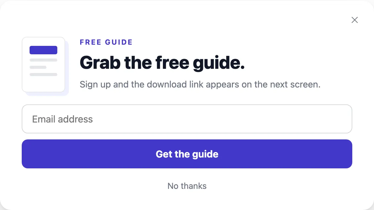
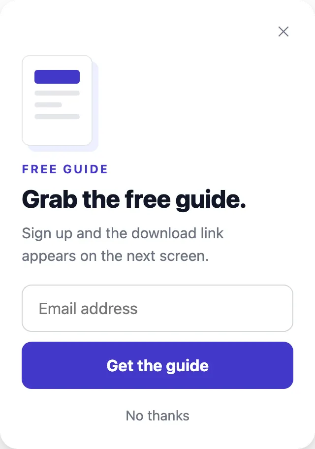
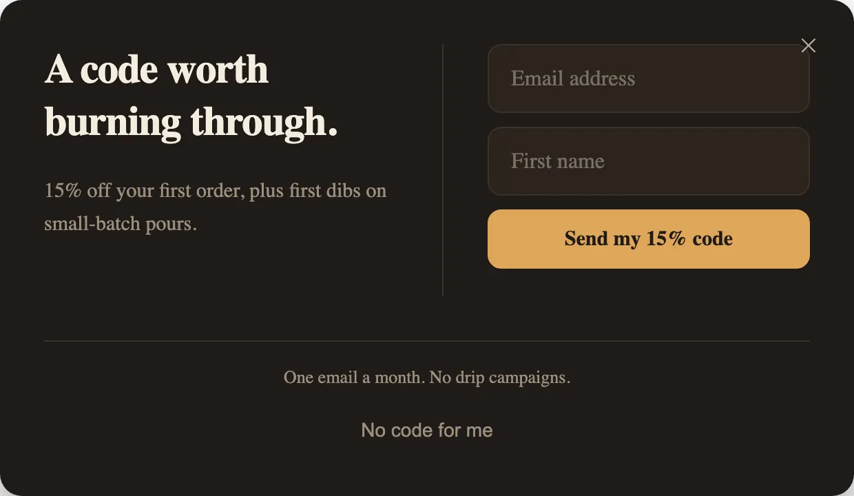
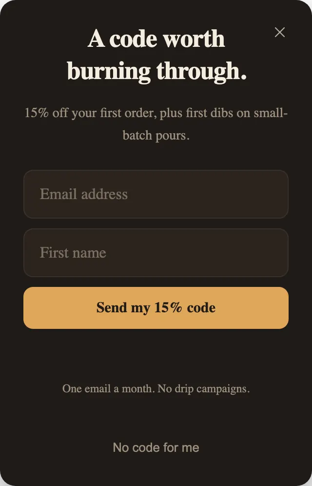
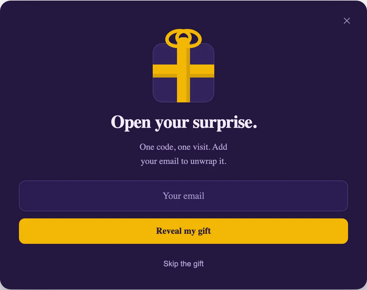
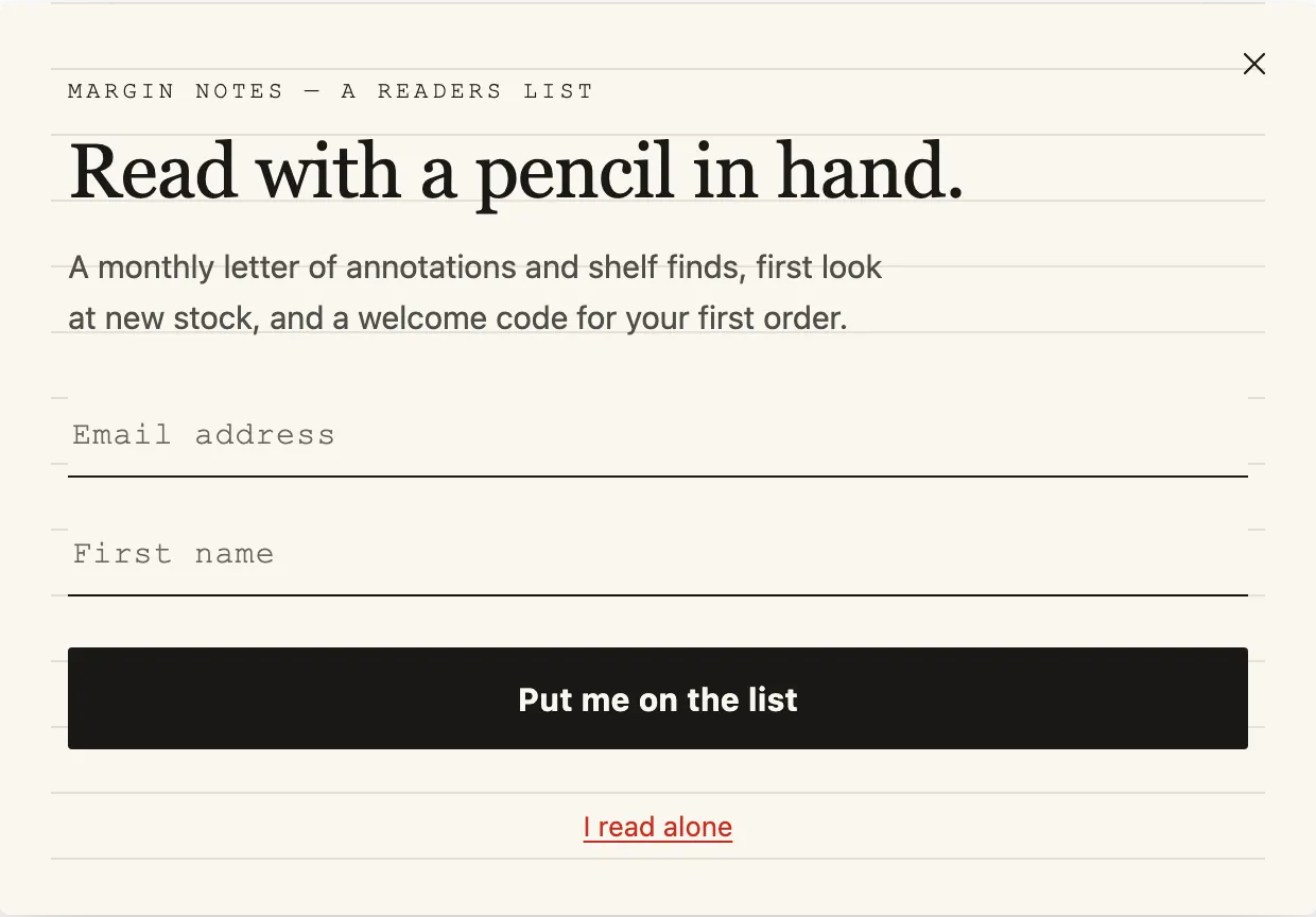
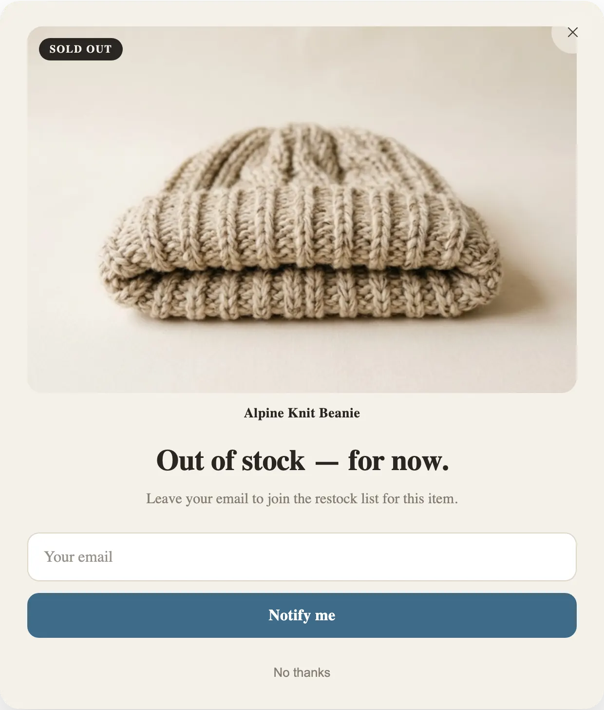
A visitor who sees a signup form asks one question before typing anything: what do I get, and what will you send me? Each example above answers it in its first two lines. Lead Magnet names a guide. First Flame names a percentage and how often the letter arrives. Back in Stock names the item that is sold out. None of them asks for an address in exchange for nothing.
So the first design decision is the offer, not the colors. Pick the reason you can actually give: a code you are willing to honor, a guide you have written, a list people already want to be on. Then choose the template whose structure fits it. A guide wants a download step. A code wants a reveal step with a copy button. A restock list wants nothing after the form except a thank-you.
Design: one field, one button, one way out
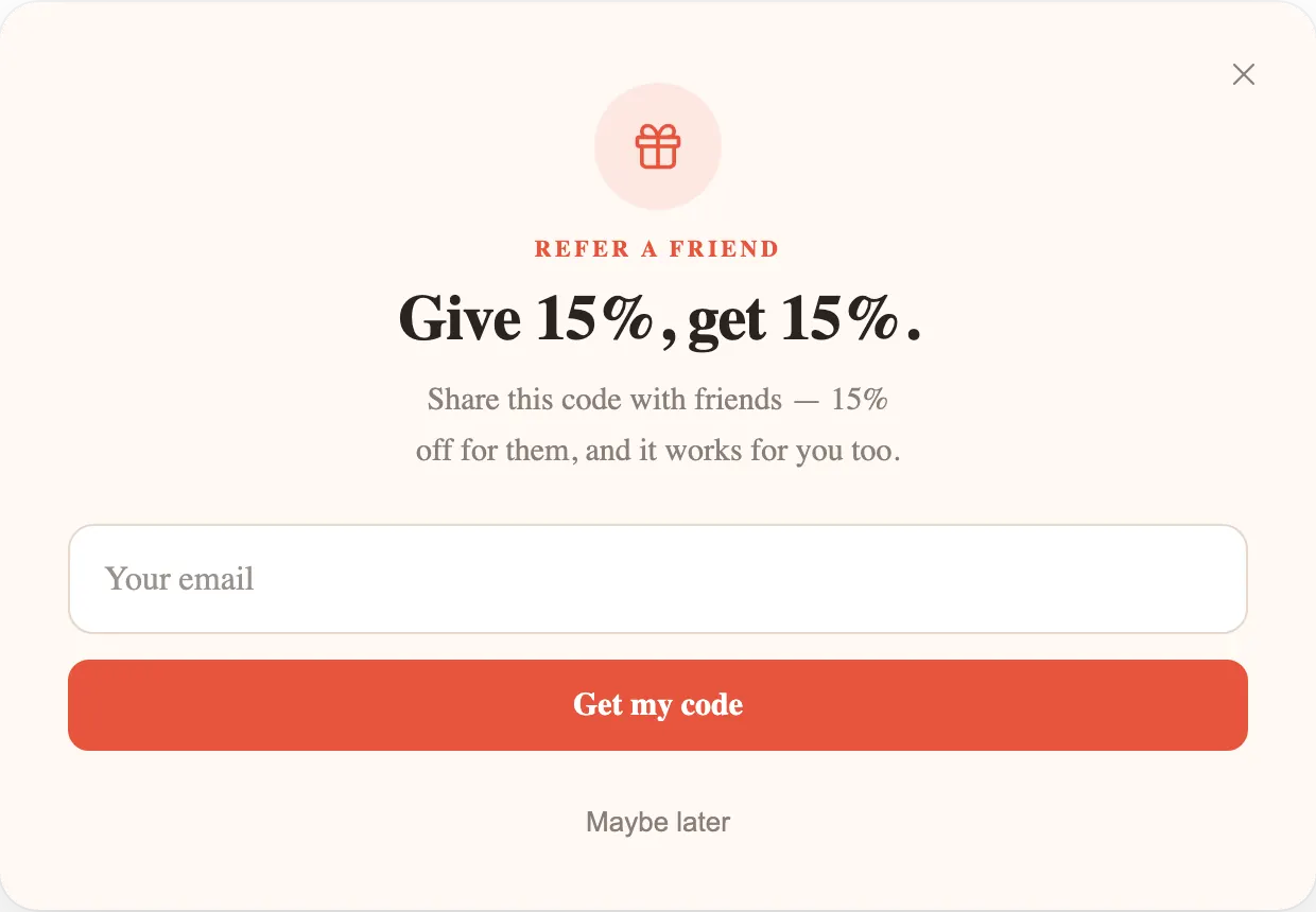
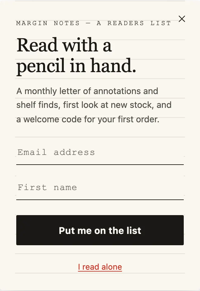
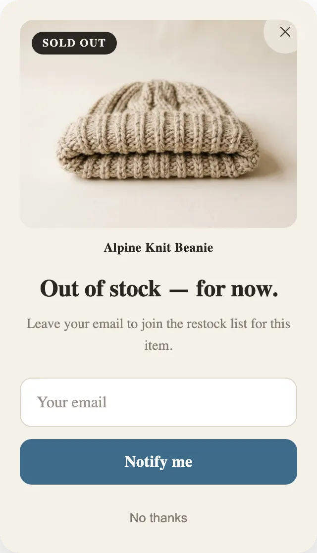
Look at the forms in these templates and they share a shape. One email field, sometimes a first name. One button whose label says what happens next, such as “Send my 15% code” or “Notify me”, rather than “Submit”. And a quiet way to say no under it, like “No thanks” or “I read alone”.
Every extra field is one more thing to type on a phone keyboard, so ask only for what your first email will use. If you will not write “Hi Anna”, leave the name field off. A phone field only makes sense if you send text messages. In the Settings tab, Lead capture turns the name and phone fields on and off and sets the button text.
The decline link matters as much as the button. A visitor who can close the popup in one obvious tap is a visitor who keeps browsing. Write it plainly; a guilt-trip line costs you goodwill on every visit.
Copy that reads in three seconds
Most visitors read the headline and the button and nothing else. Put the offer in the headline: “Give 15%, get 15%.” is complete on its own. Use the line under it for the one detail that removes doubt, such as how often you email or that the code is for a first order.
- Name the thing: the guide’s title, the percentage, the item that is sold out.
- Say what happens after the click: “the download link appears on the next screen.”
- Promise only the email you will really send. “One email a month” must be true.
- Keep the button to a verb and the benefit: “Get the guide”, “Reveal my gift”.
When to show it
Every built-in template opens 5 seconds after the page loads, so you see it right away after applying it, and keeps the trigger it was made for beside that timer. Lead Magnet also opens when a reader scrolls 40% down the page or moves to leave. First Flame and Marginalia add exit intent. Change any of it on the Trigger card in the Workflow tab.
As a practice, give people a moment with the page before asking. A reader halfway through an article has shown interest; a visitor who has been on the page for one second has not. If you keep the timer, consider a longer delay, and turn on “Show once per visit” so the same person is not asked on every page.
Exit intent depends on a mouse, so it never fires on a phone. Keep a timer or a scroll trigger on as well and the same popup covers phone visitors.
What happens to the addresses
In the Shopify app each signup becomes a Shopify customer subscribed to email marketing, tagged “PopupGenius Popup” plus any tags you add, so it reaches the email tool you already send from. On a website, signups are listed on the Leads page with the popup, the page and the traffic source each one came from. You can download them as a CSV file or send each new one to another app.
PopupGenius does not create discount codes. Create the code where your shop handles discounts first, then enter it under Lead capture, and the popup shows it with a copy button after signup.
More on the feature itself: How email popups work in PopupGenius.